

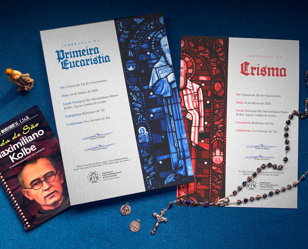
The purpose of this brand redesign was to develop a visual application standard with better applicability and functionality. Linked to the project is also the reconnection of the brand with its central purpose, borrowed from the Saint and Martyr, Frei Maximilinano, to whom it is dedicated.
maximiliano
paróquia
"Conquer the whole world for Christ through the immaculate"
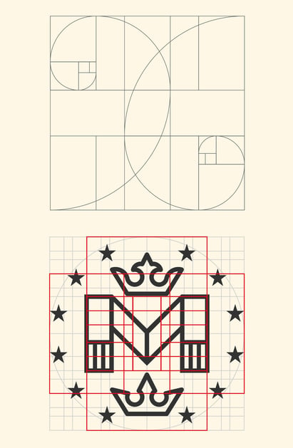
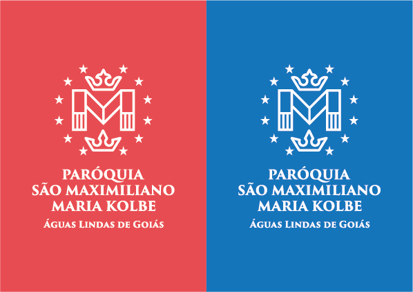
The stars that surround the symbol refer to the miraculous medal, widely publicized by Saint Maximilian. The two crowns allude to Maximilian's decision for holiness and martyrdom.
The central "M" stands for the name MAXIMILIANO and is arranged in the shape of a stole, one of the vestments commonly worn by Catholic priests.
The stripes on the stole symbolize the pattern of clothing worn by prisoners in the Nazi concentration camps where Maximilian suffered his martyrdom.

são
The blue of the brand refers to the color of the stripes on the clothes of Auschwitz prisoners and also to heaven (or paradise), which is the goal of every Christian.
The red alludes to the martyrdom of Saint Maximilian. It is also the color of fire, which represents the burning faith of those who dedicate themselves to following the call of Jesus.
